Advocating for accessibility through an understanding of our human connection to technology
Timeline
Q1 2024
Team composition
Mark Do,
Lead Product Designer
Platform
Web
Mobile
Marketing
API Packages
Skills
Design systems
Accessibility
Workshop facilitation
User interviews

If we become too reliant on technology without first understanding how design principals manifest in practical terms, we may lose our human connection to technology, resulting in the evolution of systems that do not inherently benefit us.
Bridging accessibility and quantum complexity
Design systems have always been a core part of my skillset from the very beginning of my career. Having built design systems from the ground up at MyHealth1st, and Trabr, I knew I could lead the design and implementation of Q-CTRL's design system with a refined approach.
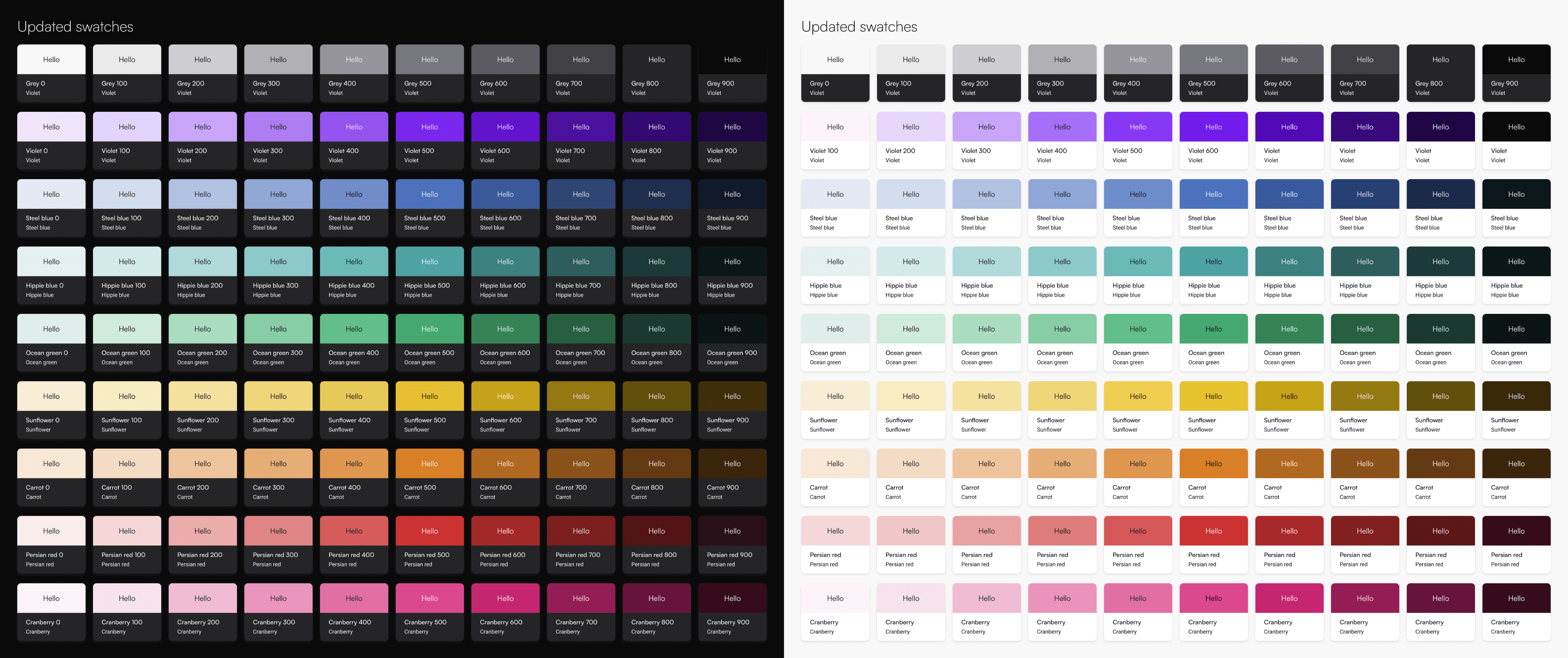
Creating Q-CTRL Visualization Library was one of my first initiatives advocating for accessibility within the organization. Visualizations are critical within the quantum computing workflow as they communicate the efficacy of experiments, simulations, and optimizations as the user progresses through the product.

Building systems from the ground up
The problems with the Library were quite evident. There was no documentation around it's usage and there were no style guidelines. The colors were inaccessible, they provided poor contrast ratios, alienating users with visual impairments. This all led to problems with scalability as ad-hoc solutions couldn't support Q-CTRL's growing suite of quantum software tools, alongside the needs of marketing and sales to produce compelling content which aligned with the brand.

Mission
Create a unified, WCAG-compliant color system that balances scientific precision with accessibility, while fostering cross-team collaboration.
Why this matters, beyond quantum computing
One of the blockers to getting this work off the ground was that, it wasn't within the product roadmap or within the scope of design. Yet for me, this was a crucial element to advocate for and work towards. I strongly believe in designing experiences that are inclusive of people with different abilities.
This proved to be a great opportunity to take the initiative to deepen my practical knowledge, alongside advocating for a cultural shift in the way the organization approaches designing for accessibility.
Exploring primary sources
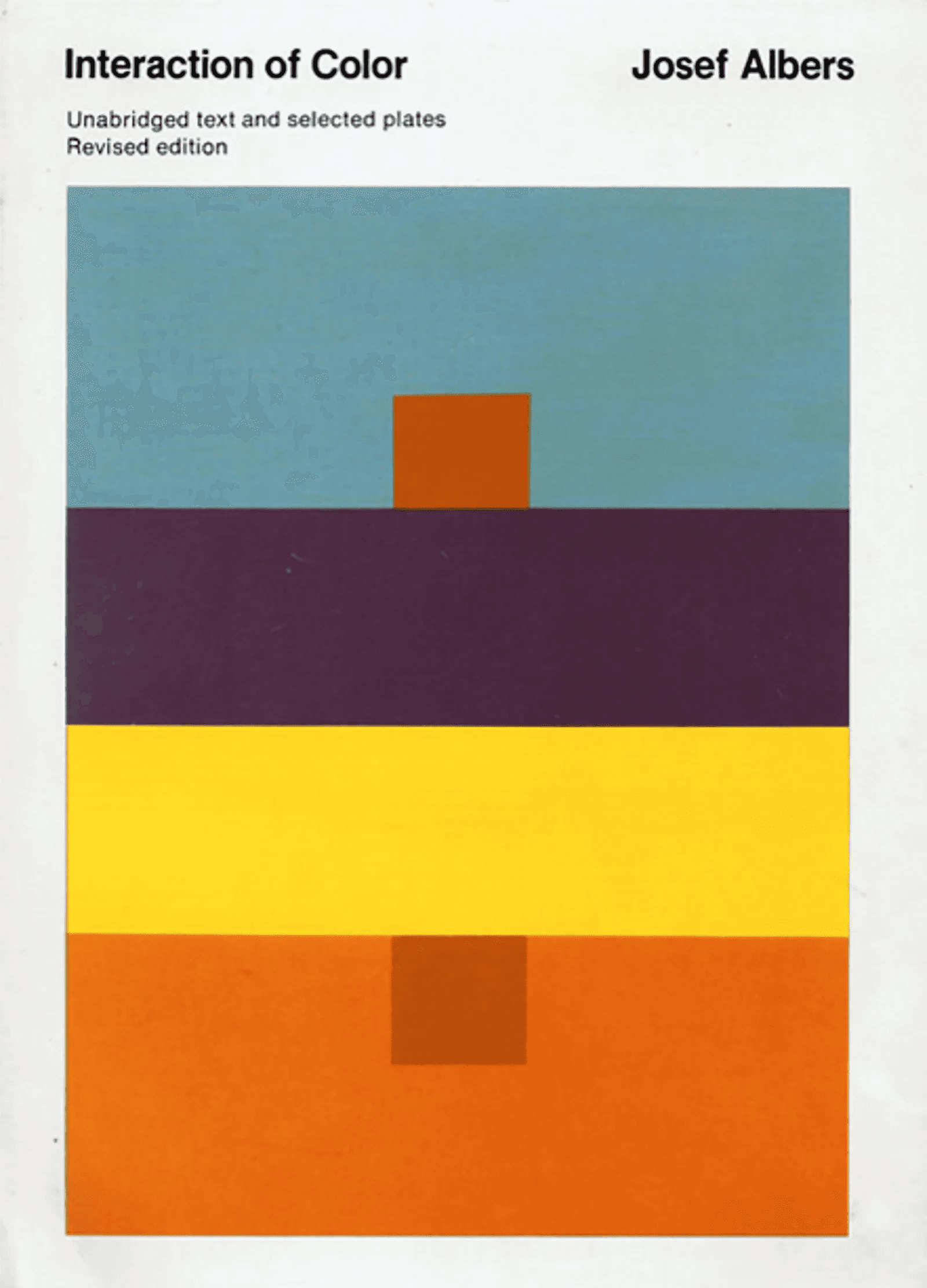
A major influences though my design process was taking the time to consider a few primary resources. Josef Albers, The Interaction of Color, proved to be a monument text which taught me invaluable lessons in contrast and perception. Color is simply a reflection of light travelling along a wavelength, when two colors come together -- they either exist in harmony or in juxtapositon.


Going back to basics
One thing to note through the process of this research was the importance of understanding our human connection to technology and how that may influence accessibility.
For example, when examining the purple squares -- would you say the colors in center are different shades?
They're actually the same, yet the colors that we contrast them with significantly affects our perception.
This isn't something that you can understand by inputting hex-codes into algorithms, it's something that requires a deeper understanding of how perception influences the interaction of colour.
The importance of our human connection to technology
Perhaps the greatest testament towards understanding what it means to be a designer lies within these learnings. More often than not, it may be easier to rely on algorithms to make advancements in our work. Yet, if we become too reliant on technology without first understanding how design principals manifest in practical terms, we may lose our human connection to technology, resulting in the evolution of systems that do not inherently benefit us.
So here’s a gentle reminder; take a step back, away from our screens, remember the playfulness of design. Experiment, and try something new.
Simulating color blindness to test accessiblity
My research eventually led to a thorough process of testing utilising visual impairment simulations within figma. I did my due-dilligence and I created thousands of colour palettes in order to reach my goal. I am most proud of is how accessible this system is for people with different abilities, achieving what I had set out to.


Low-scale user testing
Without a formal budget within the scope of this discovery, I opted to perform testing internally with Quantum Product Engineers and the Design Team. Testing was conducted through design reviews and ad-hoc usability testing sessions.
From chaos to cohesion
In the end, I was successful in implementing the system and creating the necessary documentation that went along with it. The impact of this project led to a cultural shift in the way the design team approached accessibility . I eventually led the development of a refined global colour palette for Q-CTRL's Design System, which would eventually be used to implement dark mode within the products.
Adoption
95% team adoption within 3 months
Efficiency
Reducing design-dev handoff time by 40%.
Scalability
Research led to the implementation of a refined colour palette for dark mode
Cultural shift
Pushed for an org-wide accessibility checklist, inspired by BOIA’s 6 rules